PEA-189 S1 + S2 - Dev Build vs Locked Comps
#ebe7df is missing, so the white inputs render invisible against the white-ish page background; (D2) the Signature Method horizontal pill picker degraded into a vertical radio-button layout; (D3) a "Settings / Admin" 6th item appears in the sidebar (does not belong on the agent funnel view); (D4) input field BORDERS are absent so even when filled, the inputs blend into the page. The pattern matches Lucca's aff3a5a first-build behavioral leak that broke the S2 style contract tests - amended at b261277 and force-pushed, but the markup damage carried through.
DemographicsBreadcrumb / { items: [...] } API and hand-rolled markup outside the cosmetic scope of PEA-189 (per PeachBot msg 489 yesterday at ~16:19 ET). The amendment b261277 got the tests green but the hand-rolled JSX retained markup that doesn't match the design-system class selectors in globals.css. Net: the v2 design tokens are present, but the structural HTML they target is wrong.
S1 New Lead - side-by-side
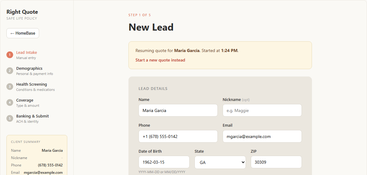
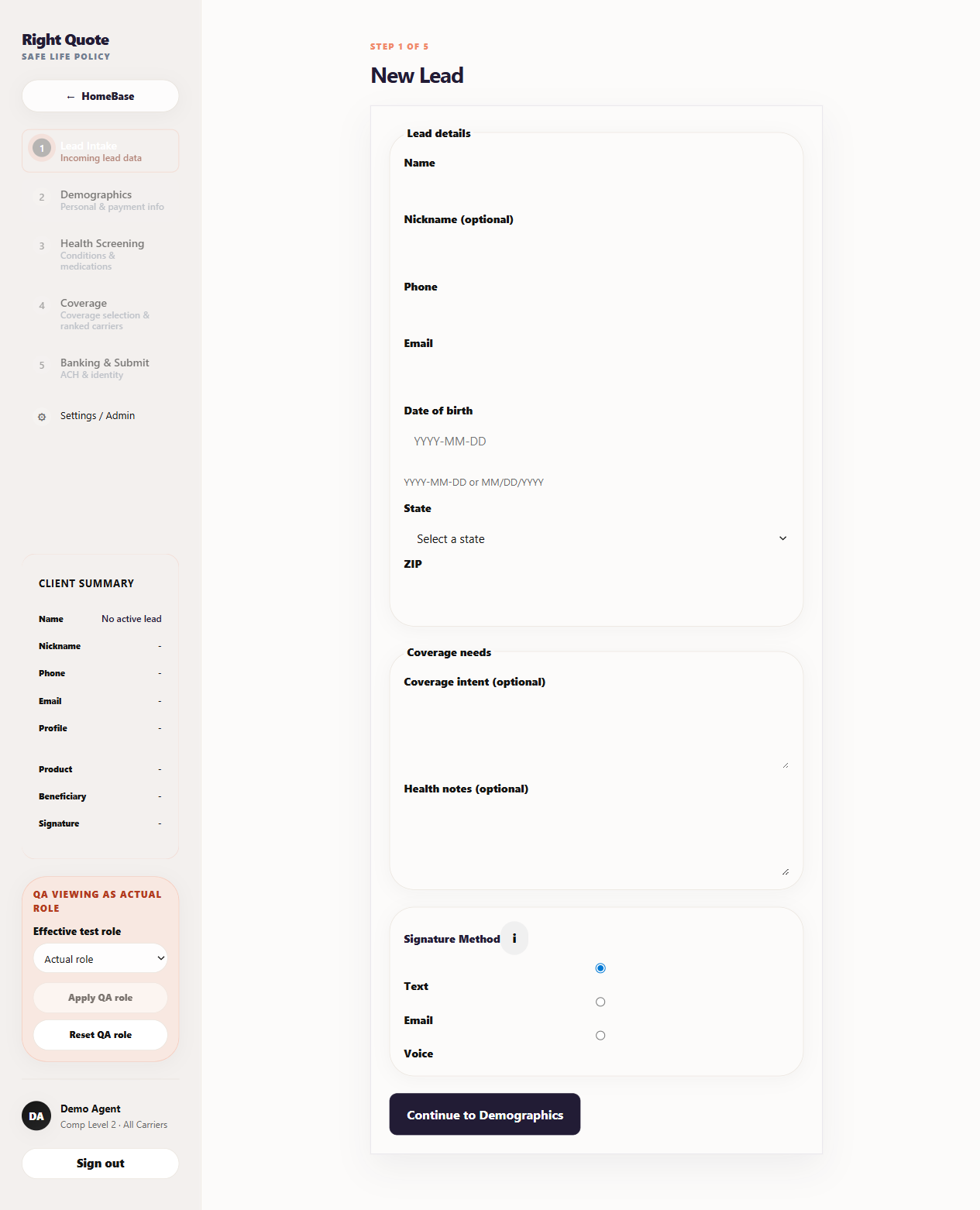
Numbered deltas
| # | Location | Expected | Actual | Severity | Likely fix |
|---|---|---|---|---|---|
| 1 | Lead Details form card | Warm-gray fill #ebe7df wraps the section, white inputs visible inside |
Card has only a thin border; background is white/near-white, inputs blend into page | Critical | Restore .form-card { background: #ebe7df } + input border styling |
| 2 | Signature Method pill picker | Horizontal 3-button pill row (Text / Email / Voice), Text active with dark fill | Vertical radio-button list, labels stacked, no pill styling | Critical | Re-instate .sig-pills horizontal pill component; confirm structural HTML matches comp |
| 3 | Sidebar step list | 5 steps shown (Lead Intake / Demographics / Health Screening / Coverage / Banking & Submit) | 5 steps + a 6th "Settings / Admin" item with ⚙ icon | High | Funnel sidebar should NOT show Settings/Admin (that lives in admin-context navs only). Remove the 6th item from the agent funnel layout |
| 4 | Input field borders | Each input has visible 1px solid #d9d5cc border on white bg |
Inputs render with NO visible border / background - completely invisible when empty | Critical | Restore .field input { border: 1px solid #d9d5cc; background: #fff; } |
| 5 | Step 1 indicator | Orange circle "1" filled + orange "Lead Intake" label | Gray circle "1" (not filled) + orange "Lead Intake" label | Medium | .step-num.active styling missing; should apply background: #e07a5f |
| 6 | Coverage needs card | Warm-gray #ebe7df form-card wraps the section |
Same as #1 - no warm-gray fill, only a thin border | Critical | Same fix as #1 - form-card class missing/wrong |
| 7 | Coverage intent / Health notes textareas | White textarea inputs with borders, ~70px tall | Textareas rendering but with no visible border; invisible against page bg | High | Same textarea border-fix as #4 |
| 8 | Step descriptions copy | "Manual entry" / "Personal & payment info" / "Conditions & medications" / "Type & amount" / "ACH & identity" | "Incoming lead data" / "Personal & payment info" / "Conditions & medications" / "Coverage selection & ranked carriers" / "ACH & identity" | Medium | Two divergences: step 1 desc ("Incoming lead data" vs "Manual entry") + step 4 desc ("Coverage selection & ranked carriers" vs "Type & amount"). Reconcile against comp + spec |
| 9 | Step 3 desc wrapping | "Conditions & medications" fits on one line | Wraps to "Conditions & medications" on two lines |
Low | Layout-space issue from sidebar width or font-size - cascades from #5 likely |
| 10 | QA viewing widget | Not present in comp State A (it's a dev-only role-switcher) | Visible as a pink-cream block above the agent footer | Low | Acceptable for dev - widget is intentionally dev-only. NOT a regression. Flagged for completeness only |
| 11 | Sign out button | Not present in comp - bottom of sidebar is the agent footer only | Pill-shaped "Sign out" button at the very bottom of the sidebar | Low | Likely intentional addition for the dev-build. Confirm whether comp should add sign-out OR remove from build |
| 12 | Resume Quote panel | Yellow callout "Resuming quote for Maria Garcia. Started at 1:24 PM. [Start a new quote instead]" | Absent (build is in fresh state; no in-progress quote to resume) | Low | State-dependent. Comp State A shows WITH-resume; State B shows WITHOUT. Dev correctly maps to State B when no in-progress quote. NOT a regression |
| 13 | Sidebar layout spacing | Tight spacing between rows, step 2 description fits on one line | More vertical breathing room; some descriptions wrap (cascades to #9) | Low | Padding/font-size cascade from layout shell - secondary to #1-7 fixes |
S2 Demographics - side-by-side
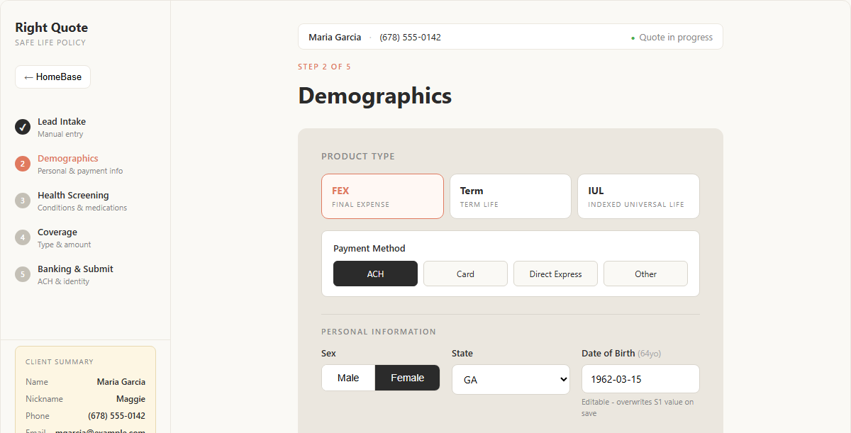
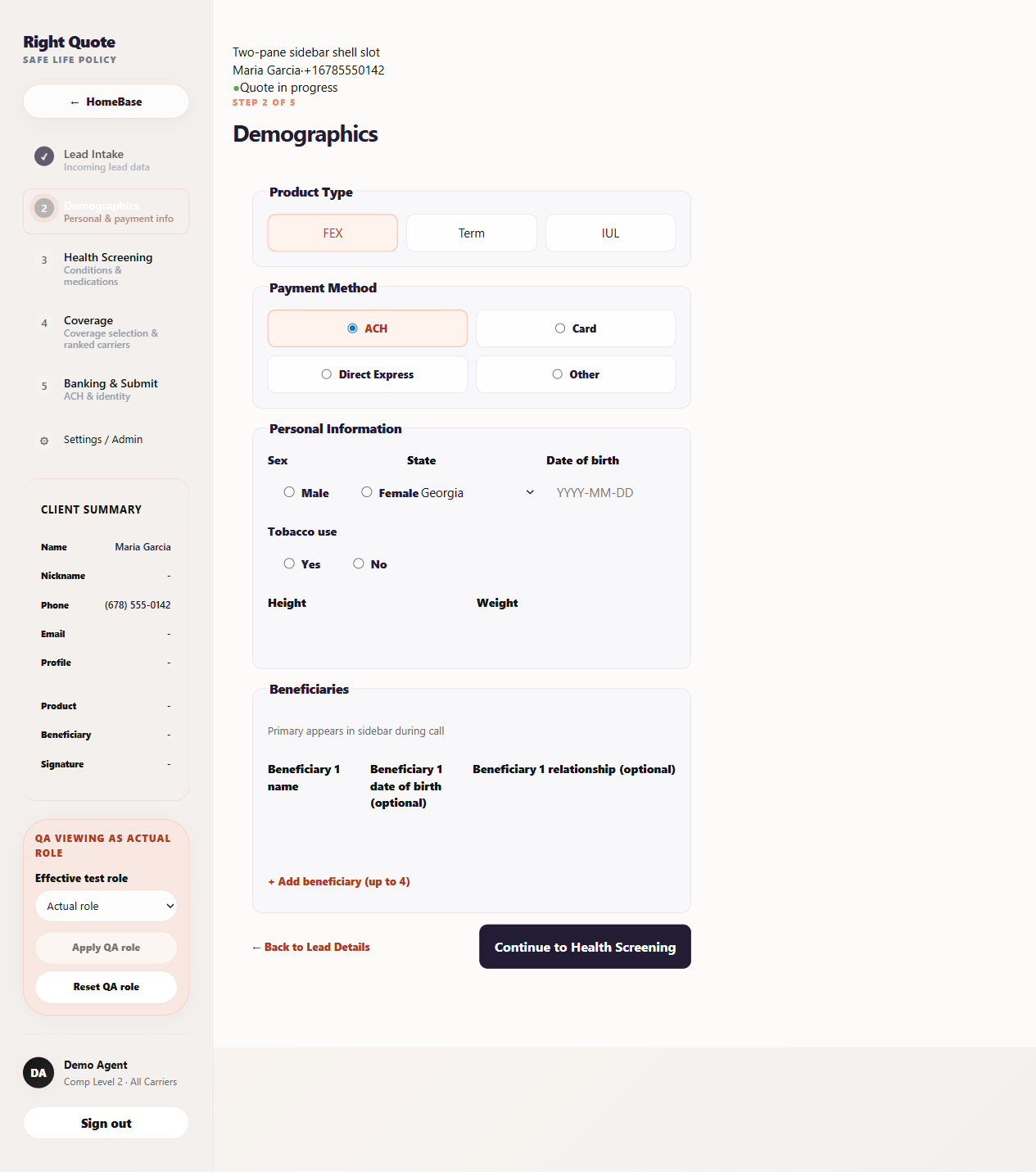
S2 numbered deltas
| # | Location | Expected | Actual | Severity | Likely fix |
|---|---|---|---|---|---|
| S2.1 | Top of main column - header bar | Compact header with name + phone + "Quote in progress" pill, styled as a single horizontal bar | "Two-pane sidebar shell slot" placeholder text visible as plain text, ABOVE the name/phone/status line. Layout is broken vertical stack, not horizontal bar. | Critical | Remove the Two-pane sidebar shell slot debug string from the rendered output - it's leaking from a placeholder/scaffold component. Then rebuild the header bar with horizontal layout per comp |
| S2.2 | Product Type tiles | Three tiles with abbreviation + descriptor: "FEX / FINAL EXPENSE", "Term / TERM LIFE", "IUL / INDEXED UNIVERSAL LIFE" | Three tiles with only abbreviations - no descriptor subtitles | High | Restore descriptor lines under each Product Type abbreviation |
| S2.3 | Payment Method options | Four pill-style buttons in 2x2 grid: ACH (selected with dark fill) / Card / Direct Express / Other. No radio circles - pure buttons | Four options rendered as radio buttons with the radio circle visible (○ ACH selected) - not pill-style. Same regression as S1's Signature Method (delta #2) | Critical | Use the same .toggle-pill / .choice-pill pattern as S1 sig-pills. Confirm component reuse, not hand-rolled radios |
| S2.4 | Sex field | Two pills "Male" / "Female" inline, one selected with dark fill | Radio buttons (○ Male / ○ Female) inline. Same pill-degradation pattern as S2.3 | Critical | Same pill-component fix as S2.3 |
| S2.5 | State select layout | State dropdown sits in its own column, value clean | "Georgia" text overlaps visually with the Female radio button text - layout collision indicates field-row column widths are not constrained properly | High | Field-row CSS missing - inputs need to claim their column without overlapping adjacent fields |
| S2.6 | Date of birth field | Populated value "1962-03-15" with inline "(64yo)" age hint | Empty placeholder "YYYY-MM-DD" - script's fill may have failed silently, OR same invisible-input regression as S1 (the value is there but the input box itself isn't visible) | High | Same input-border fix as S1 deltas #4 / #7. Also verify the "(64yo)" inline computed display is wired |
| S2.7 | Tobacco use | Yes / No pills inline, one selected with dark fill | Radio buttons (○ Yes / ○ No) inline. Same regression as S2.3 / S2.4 | Critical | Same pill-component fix as S2.3 |
| S2.8 | Height / Weight inputs | Two text inputs side by side with visible borders, populated with example values | Labels visible, no input boxes - same invisible-input regression as S1 | Critical | Same input-border fix as S1 delta #4 |
| S2.9 | Beneficiaries section inputs | Three input rows (Name / DOB / Relationship) with visible borders, sample values populated | Labels visible, no input boxes - same regression as S2.8 | Critical | Same input-border fix as S1 delta #4 |
Root cause analysis
PeachBot's own commentary yesterday at msg 489 (~16:19 ET) is the smoking gun:
"Root issue: Lucca invented a DemographicsBreadcrumb / { items: [...] } shape for the breadcrumb that doesn't exist. The real QuoteBreadcrumbProps is { customerName, phone, status } - a PII-summary breadcrumb, not a nav-items list. When it 'wired the real breadcrumb' to remove the placeholder, it fabricated an API."
The same first-pass build (commit aff3a5a) failed 5 tests including the S2 style contract:
"FAIL tests/s2-demographics-style-contract.test.ts > S2 demographics style contract > keeps the current S2 demographics visual markup classes covered by globals.css selectors"
PeachBot then amended at b261277 to get the test suite green (907 passing) and force-pushed over the broken commit. PR #145 squash-merged that amended state to develop, deployed to dev at ~17:11 ET. The amendment got the tests green but did not necessarily revert all of Lucca's hand-rolled markup. The class selectors targeted by app/globals.css may now be hitting stale DOM that Lucca rewrote rather than the canonical component output.
Why critical deltas D1, D2, D4, D6, D7 cluster together
- All five are about form structure + input rendering - exactly the surface Lucca touched when fabricating the breadcrumb prop shape and "wiring real markup"
- The
.form-cardbackground, input borders, and pill picker are all defined inglobals.cssvia class selectors (.form-card,.field input,.sig-pills) - If Lucca renamed those classes or replaced them with hand-rolled JSX without the class names, the selectors won't match and the styling silently disappears
- This is a silent failure mode: tests pass (because tests check behavior, not look-and-feel), but the visual contract is broken
What to inspect in the PR #145 diff
app/app/intake/page.tsx- look for hand-rolled form structure replacing component importsapp/app/intake/components/*- any new components Lucca created vs reuse of existing ones- Class name usage - count occurrences of
className="form-card"andclassName="field"in the changed files. If they're 0 or replaced, that's the smoking gun - Breadcrumb usage - look for the
DemographicsBreadcrumbfabrication in commitaff3a5athat should have been removed inb261277
Recommended actions
- NOW (15 min): Pull the PR #145 diff via
gh pr view 145 --repo peachpilot-ai/right-quote -dor browse on GitHub. Specifically look atapp/app/intake/page.tsxand any new files Lucca added. Confirm whether.form-cardclass is being used or was replaced with hand-rolled markup. - NOW (5 min): File the visual regression as a Bug + qa-bug sub-issue of PEA-189 in Linear. Attach this audit doc URL. Severity: Critical. Title: "S1 form-card background + input borders + signature pill picker missing on dev build."
- This weekend (Aaron's call): Hold AC7 (per-screen visual gate) FAIL on PEA-189. Do NOT sign off on AC1 (pixel match). Communicate to Ben that the merged amendment did not actually deliver the comp.
- Monday morning: Telegram message Ben/PeachBotBravo with: (a) this audit URL, (b) hypothesis that
b261277kept Lucca's fabricated markup, (c) ask for a fresh Lucca pass that REVERTS to canonical components rather than amending the broken first attempt. The bake-off framing Alon validated yesterday makes a clean restart cheaper than a third amendment. - Process change: The S2 style contract test that caught the first-build regression is exactly the kind of guardrail that should exist for S1 too. Worth filing a separate ticket: "Add S1 style contract tests for form-card class + sig-pills + field input borders" so future amendments can't silently drop visual fidelity.
Methodology
Capture script: playwright-crawl/visual-audit.js. Live build captured via authenticated persistent profile at 1280x900 viewport, fullPage screenshot. Comp captured headless at matching viewport, fullPage of file:///.../s1-new-lead.mockup.html. State A clip of the first .screen container extracted for clean side-by-side. All deltas validated by direct visual inspection. Annotation coordinates approximate; refer to the deltas table for canonical positions.